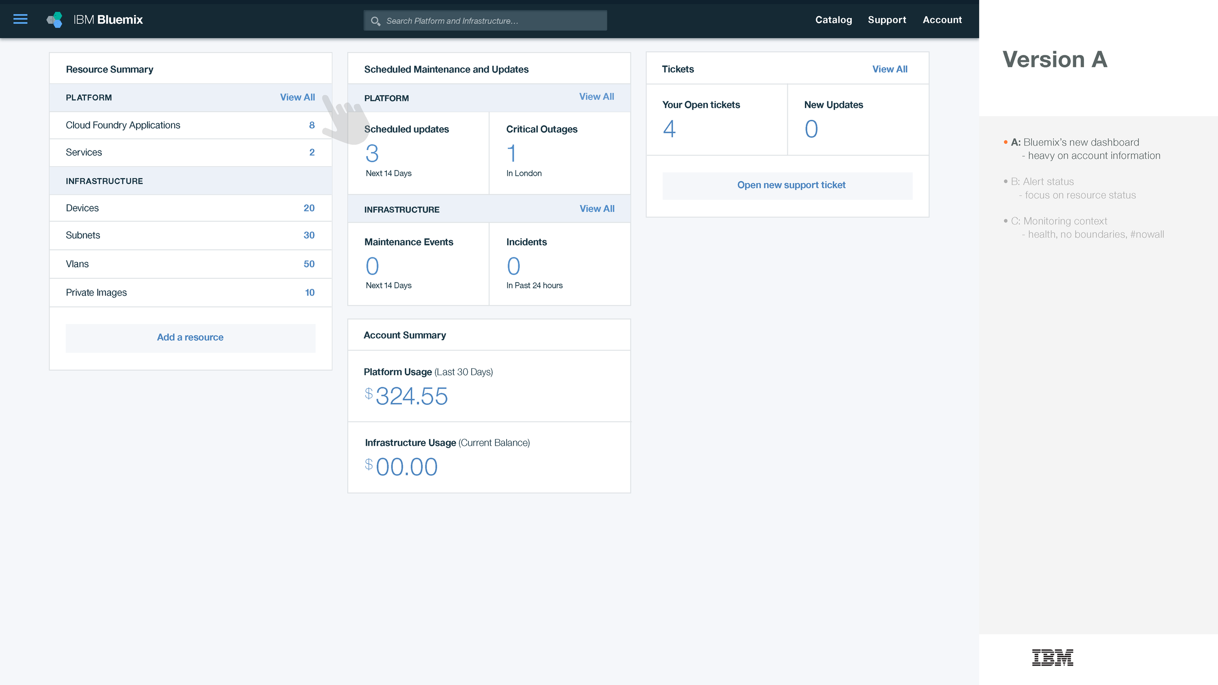
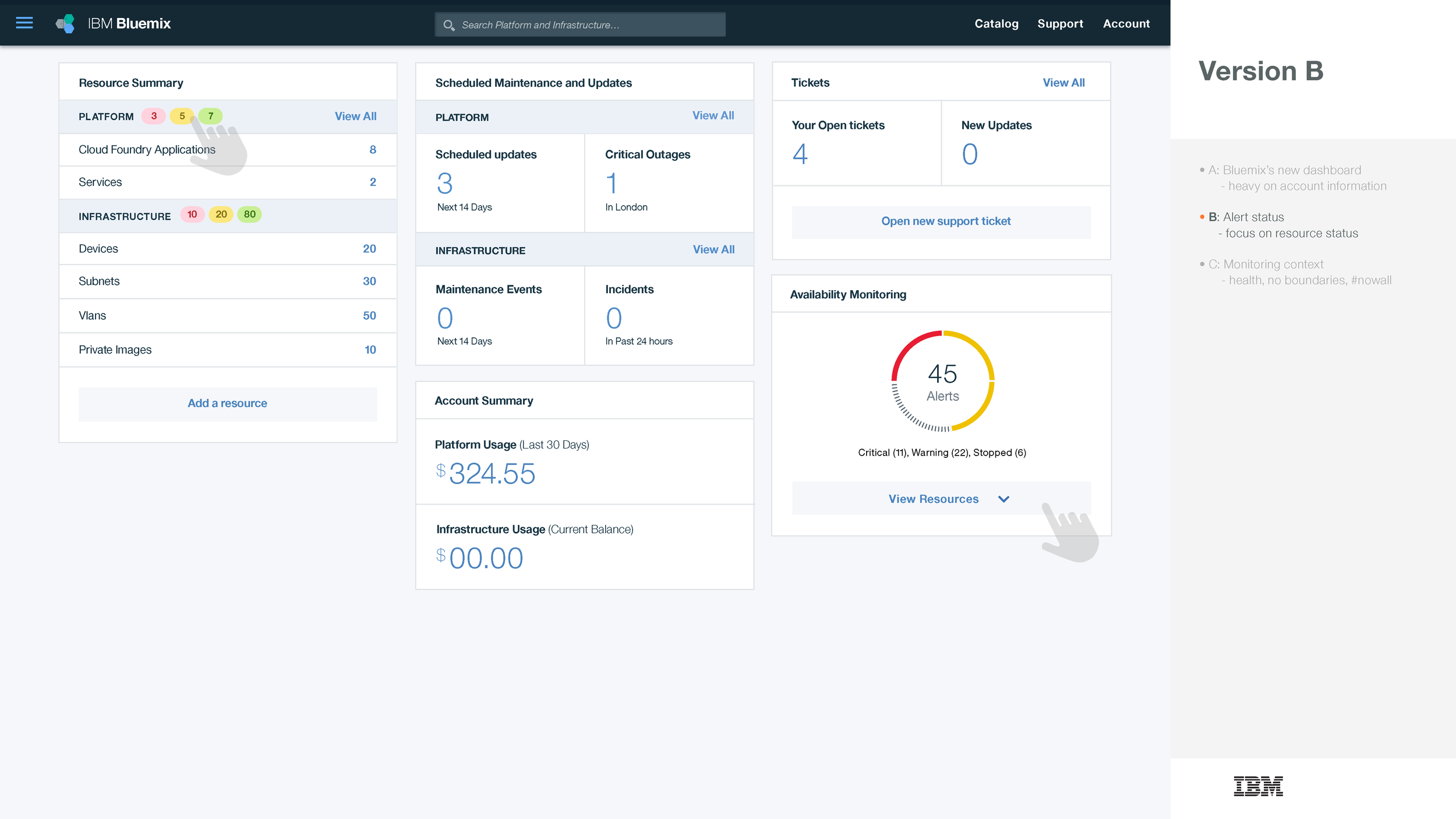
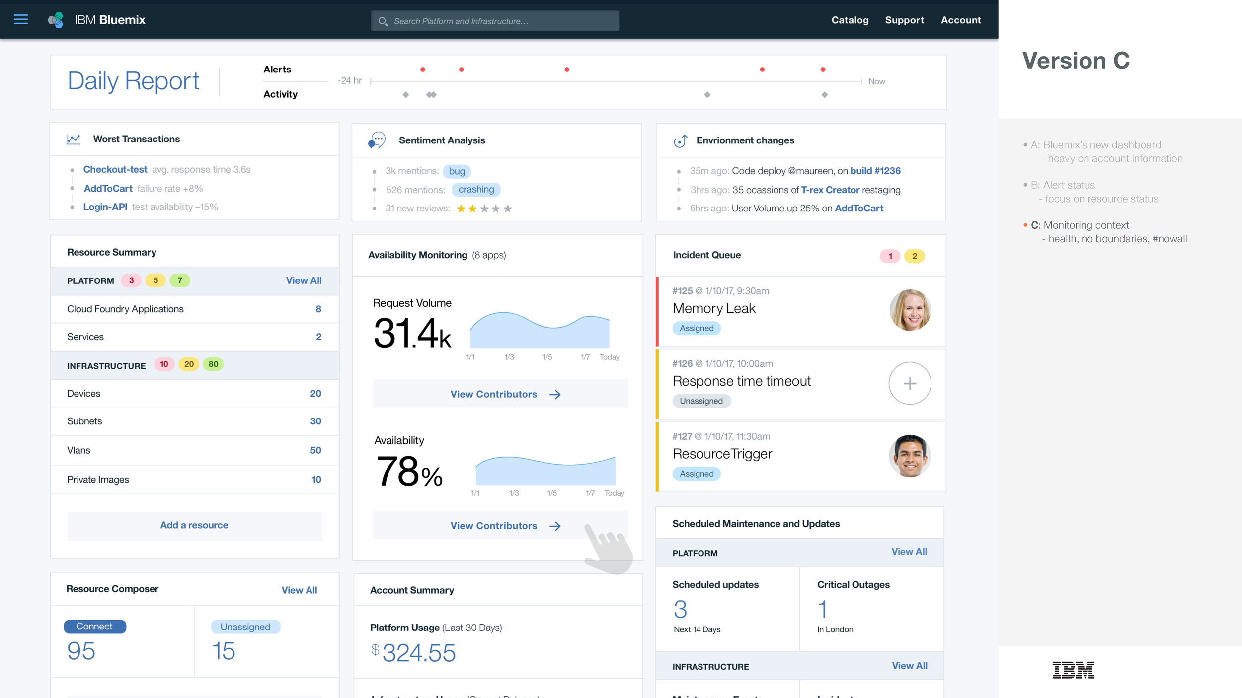
One of the three versions of the dashboard we prototyped to test.
Goal
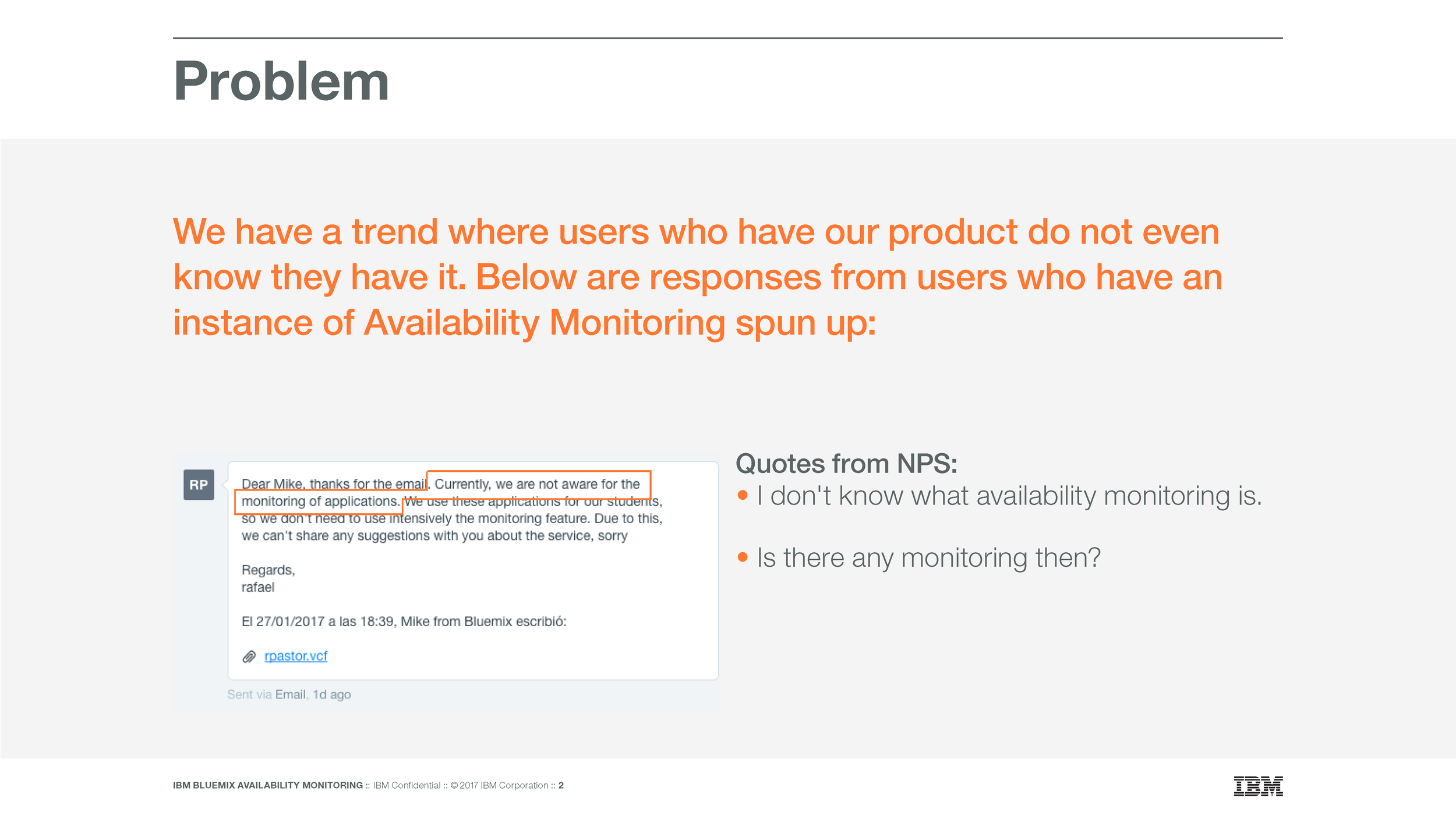
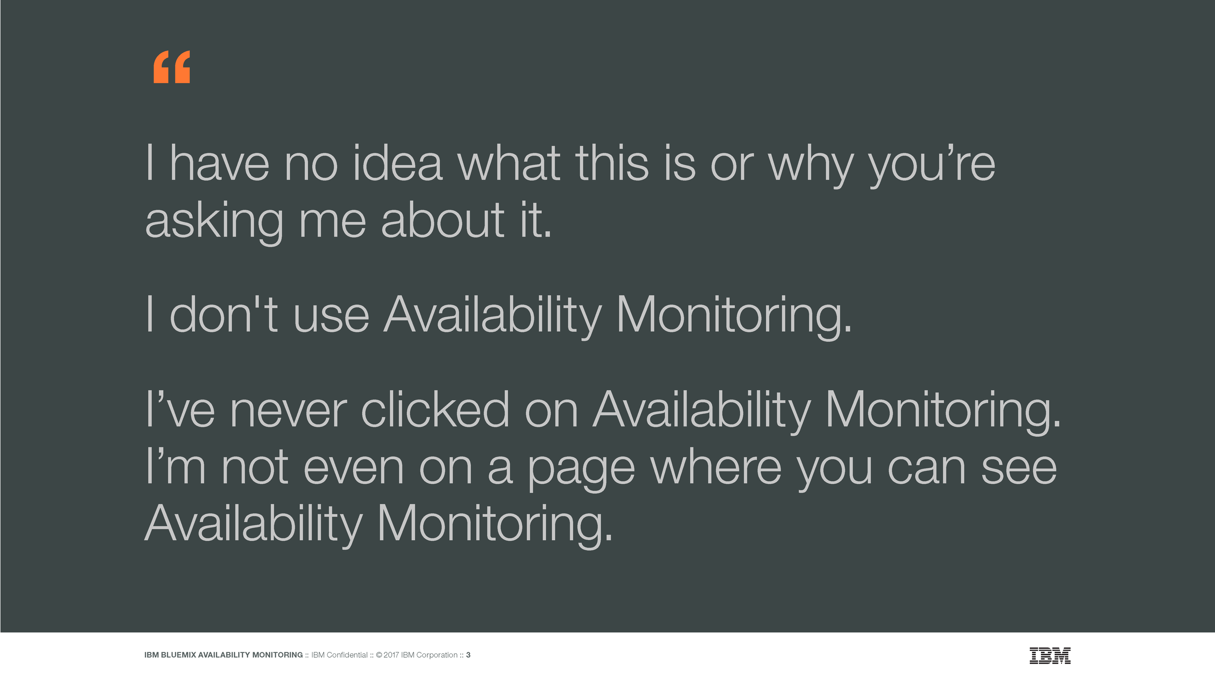
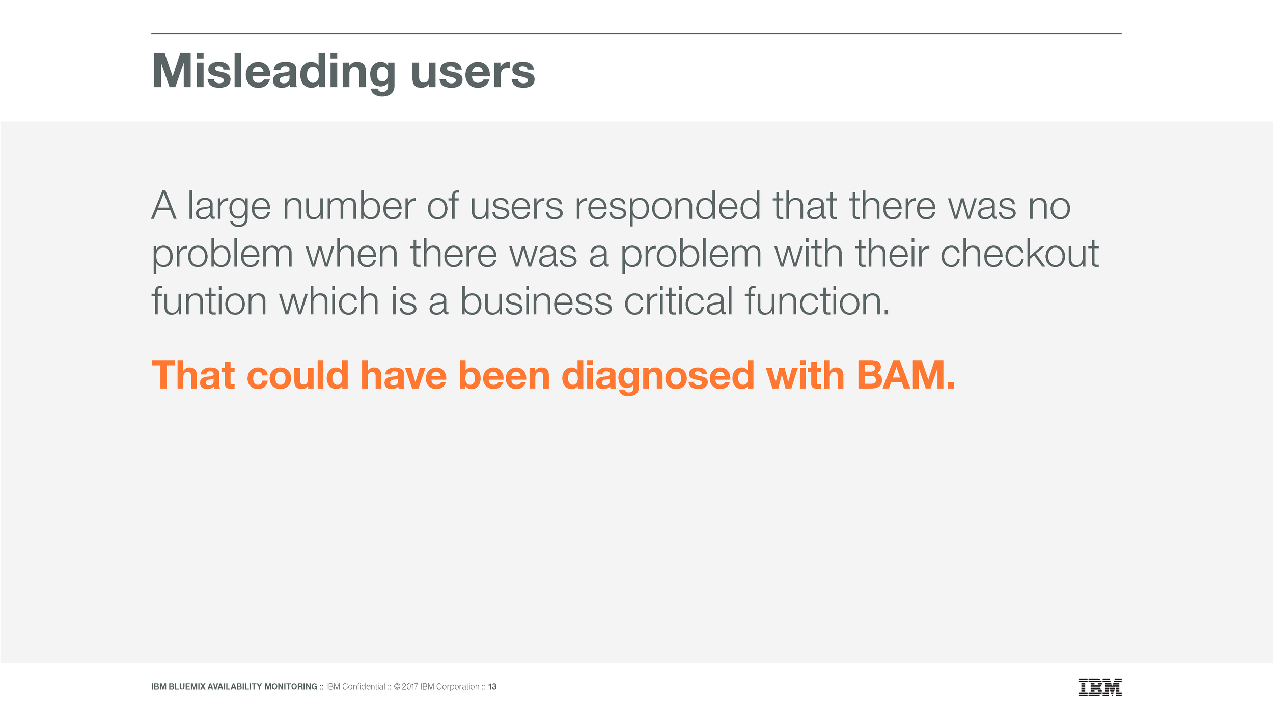
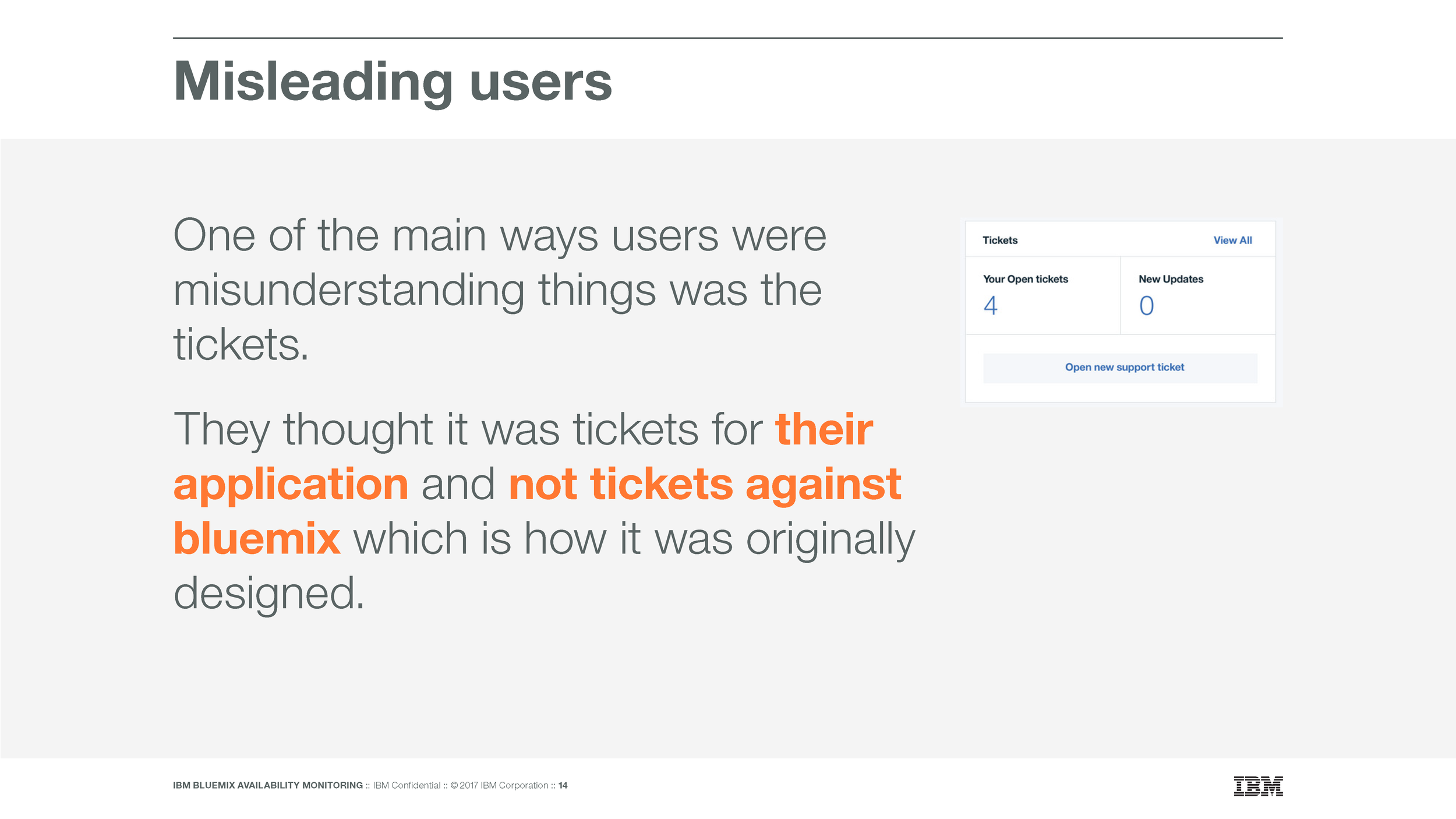
When gathering NPS data for our experience we noticed a trend in the verbatim responses that quite a few users who responded to our NPS response had no idea that they even had an instance of our application. The hypothesis I formed was focused on two possibilities:
People couldn’t find our product even though it was included in a cloud foundry application on IBM’s public cloud.
or
People could find it but didn’t understand what it was.
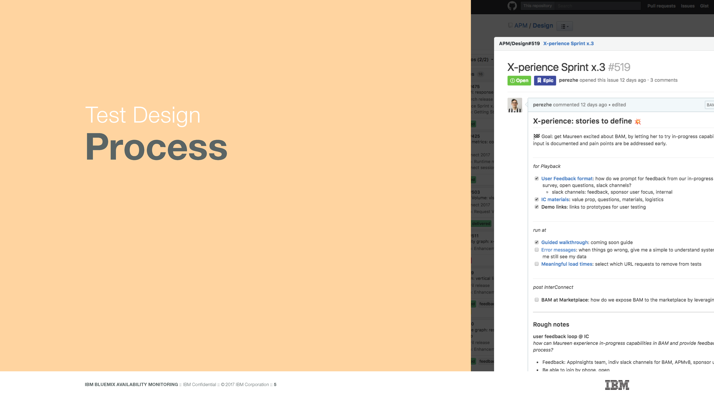
I then built out a multi-variate test to check those hypotheses
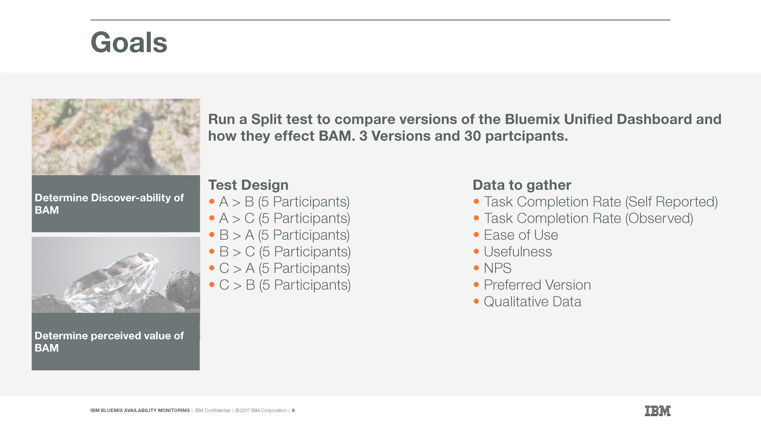
Method
Run a Split test of different versions of the IBM Cloud unified dashboard that their team was working on to see how they effected our product.
3 Versions of the dashboard
30 Participants
A > B (5 Participants)
A > C (5 Participants)
B > A (5 Participants)
B > C (5 Participants)
C > A (5 Participants)
C > B (5 Participants)
Data To gather
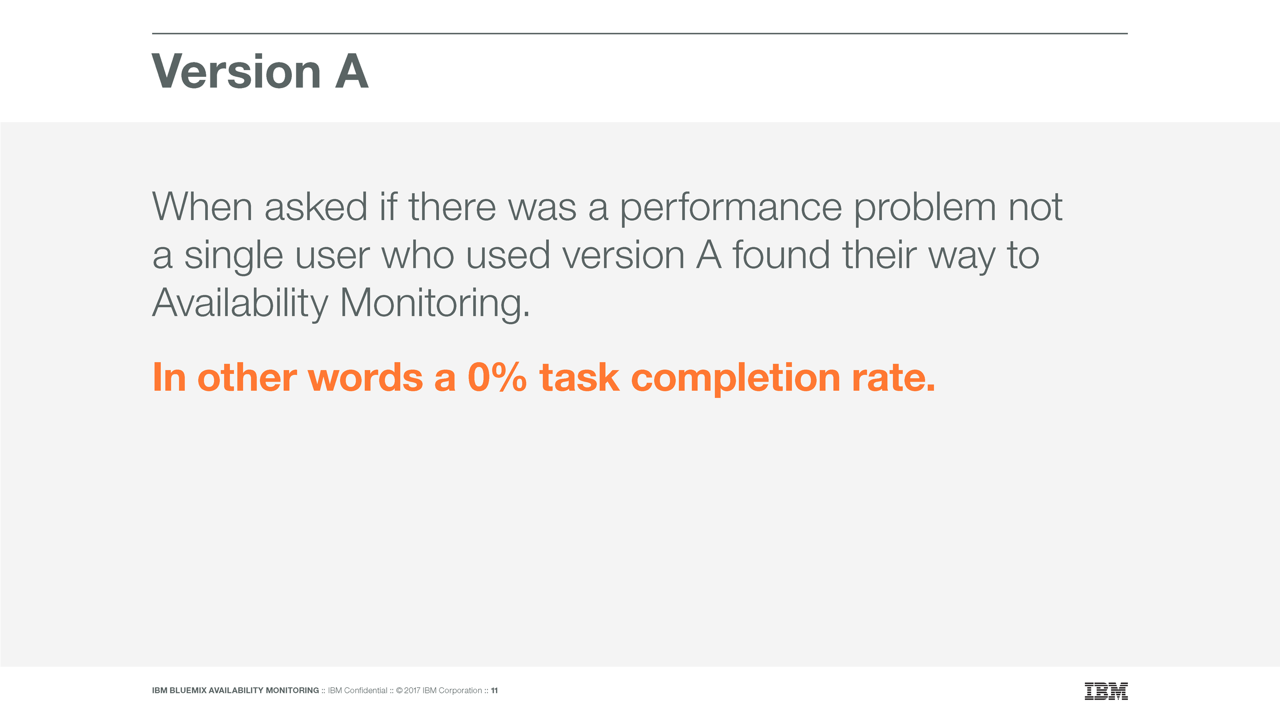
Task Completion Rate (Self Reported)
Task Completion Rate (Observed)
Ease of Use
Usefulness
NPS
Preferred Version
Qualitative Data
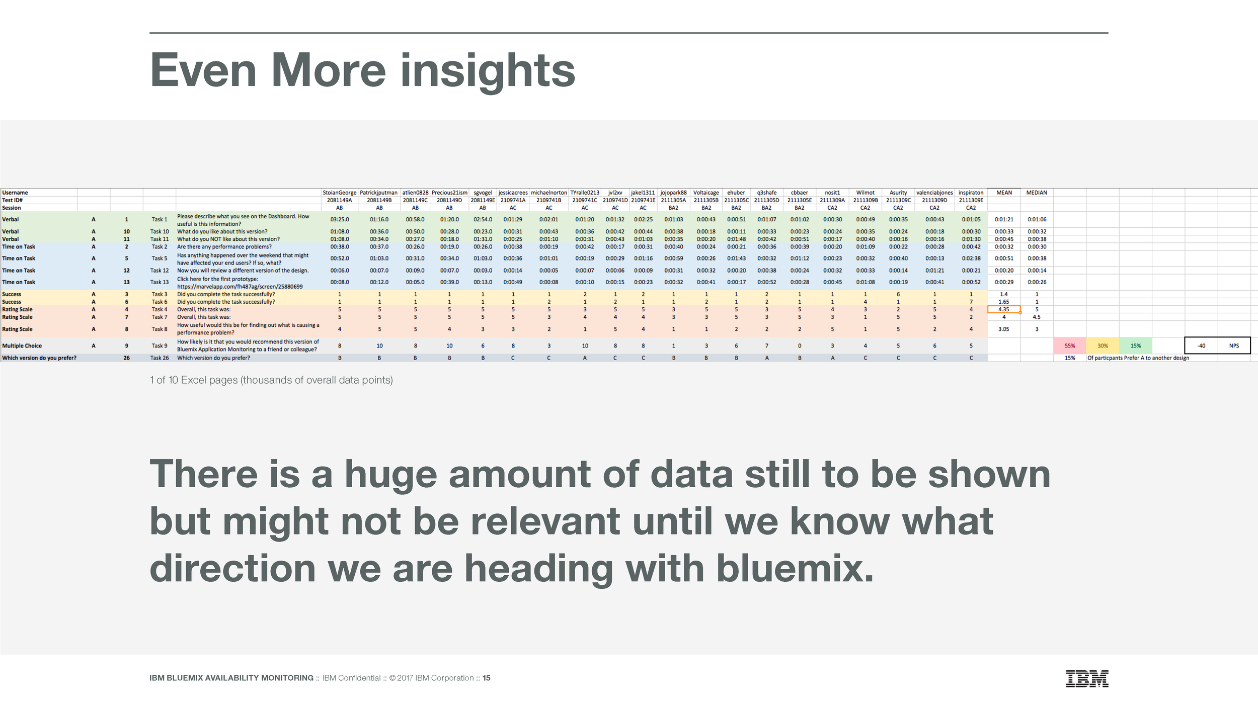
Sample of the 10 Excel pages of data we collected
Impact
After presenting the deck below at a VP level meeting I was able to get buy in on reassessing some of the Cloud teams decisions. The insights created from this study formed the basis of a months long collaboration between the our team and theirs.
Lessons Learned
I think the key to the success of the study was testing designs that the Cloud team was already considering. If we had built our own dashboards I think it might have fallen on deaf ears but by collaborating with the team already working on it we were able to tell a consistent story.
Presentation Deck